Identity
Logo
The mark and the wordmark: which version goes where.
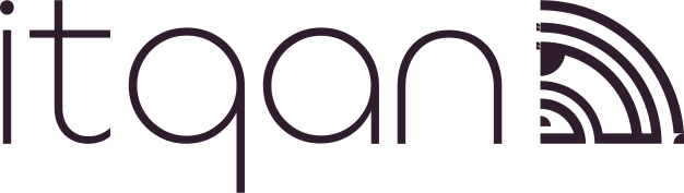
The lockup is the default. The icon exists for the places a lockup cannot survive — a favicon, an avatar, the corner of a video — and nowhere else. Both are monochrome, because a mark that depends on two colours breaks the first time someone prints it.
Approved versions
Pick by the surface it sits on, then by the space available.

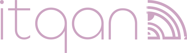
Mauve lockup
Dark surfaces where the mark should carry the accent rather than sit quiet. Never on light.
↓ SVG

Which one, quickly
Rules
Do: Use the SVG wherever the medium allows it. It stays sharp at every size.
Do: Give the mark its clear space — the height of the icon on every side.
Do: Use one colour. The mark is monochrome by design.
Do: Switch to the icon before the lockup becomes unreadable, not after.
Do not: Do not recolour the mark outside the five approved cuts.
Do not: Do not add a shadow, glow, gradient or outline.
Do not: Do not stretch, rotate, skew or crop it.
Do not: Do not set the wordmark in Manrope by hand — it is drawn, not typed.
Worked examples of each failure are on Misuse.