brands.shareefi.co
Shareefico
Engineer. Designer. Storyteller. All in one.
The personal brand of Ibrahim Shareef, founder of Itqan Studio. Deep green and lime on near-black, Clash Display at hero scale, and a voice that talks like a practitioner, not a guru. Faith is the operating system, not the aesthetic.
01 · Overview
What this brand protects.
Shareefico is one person doing three jobs on purpose: build the brand, code the system, tell the story. The identity is built around that claim — a dark green world lit by one lime accent, a single massive statement per page, and a 3D character who shows the work instead of posing with it.
01
Brand is execution
The master thesis. Not graphic design. Every artifact demonstrates it or does not get published.
02
One accent sells
Lime does the calls to action alone. When everything glows, nothing does.
03
The massive statement
Each page earns exactly one huge line. Scale is spent, not sprinkled.
04
Faith as operating system
Niyyah, barakah and itqan shape decisions before they shape sentences.
02 · Logo
The mark, and how it survives contact.
Wordmark
The written mark, off-white and lime on deep green.
Icon
App icon and avatar mark.
Favicon, lime
Small-size mark on dark surfaces.
Favicon, dark
For lime and light surfaces.
Video watermark is the faded mark, bottom right.
Never watermark video with the text wordmark.
Lime is the only CTA colour, everywhere the brand appears.
Never use blue for anything a person is meant to click.
Misuse
03 · Colour
A palette is a set of decisions.
One accent does the selling. Lime is reserved for calls to action and emphasis; the blue exists so the 3D scenes have a second temperature without competing for clicks.
Pairings
Lime on Void
The signature pairing. CTAs and emphasis.
Off-white on Deep Green
Primary reading pairing.
Void on Lime
Button labels on the accent.
HUD on Void
Secondary text, lifted specifically to clear AA.
Blue as a CTA
Readable, but banned by role: blue never sells.
04 · Typography
Type does the talking.
Hero
Clash Display
Massive single statement, one per page
Brand is execution.
Display
Poppins
Section headings
Faith and execution.
Italic accent
Playfair Display Italic
Lime, sparingly
the blueprint
Body
Manrope
16px, plain and direct
I tried this. Here is what actually happened.
Mono
JetBrains Mono
Numbers, code, HUD details
40+ episodes
Clash Display is for the one massive line a page earns. Poppins runs the sections, Manrope runs the reading, and the mono face handles numbers and interface details.
05 · Composition
Layout is rhythm.
Pages are built around a single moment: one void-black scene, one massive line, one lime action. Everything else supports that hierarchy.
One massive statement per page, on the void, in Clash Display.
One lime CTA per screen. The rest of the page defers to it.
Let the 3D character do the showing — at work, mid-task, never posing.
Spend hero scale twice on one page.
Let blue touch anything interactive.
06 · Imagery
A world, not a photo bank.
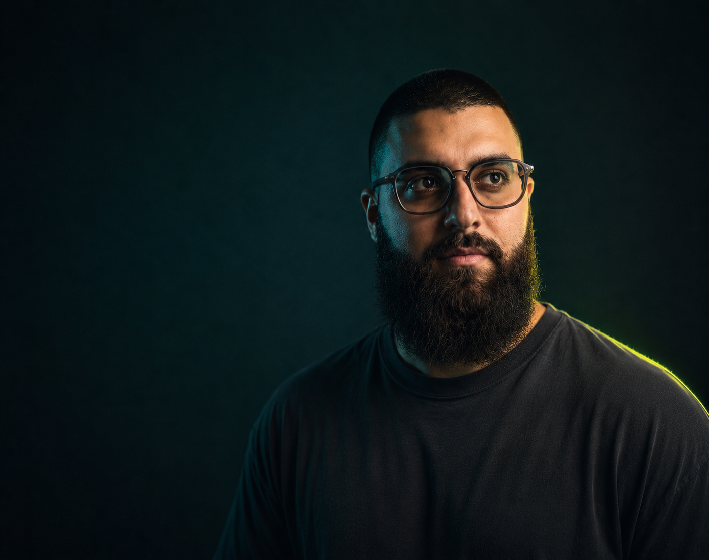
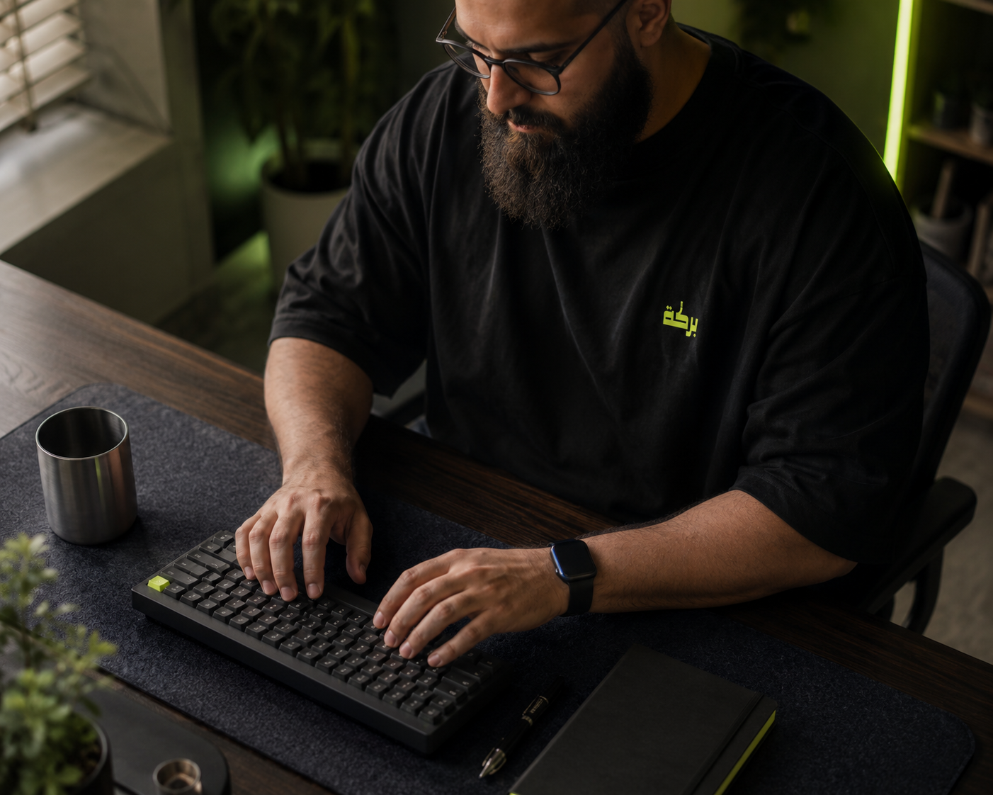
The imagery system is a 3D-illustrated world: Ibrahim's character in a deep-green studio, lit by lime, rimmed in blue. It exists to show work happening, not to decorate.

07 · Motion
Felt, not watched.
Motion carries physicality: springs over curves, reveals that respect the reader, and nothing that traps the scroll.
Reveals
fade + rise, spring-settled
Content arrives; it does not perform.
Reveal floor
always readable
Nothing stays hidden if scripts or observers fail.
CTA hover
lime → lime hover
#d7fd64 to #c8f050, fast.
3D scenes
slow drift
Ambient movement in the character scenes, never in the reading column.
Reduced motion
gentler, not silent
Opacity-led equivalents, same information.
08 · Voice
Written rules, not vibes.
Written rules, enforced in every caption, post and page. The shortest summary: practitioner, not guru.
01
Practitioner, not guru
I tried this beats you should. Lived opinion over googleable information.
02
Brand is execution
The master thesis. Not graphic design. Every artifact either demonstrates it or does not get published.
03
Faith out loud
Niyyah, barakah, itqan named plainly when they are the right word. Operating system, not aesthetic.
04
Scars, not wounds
A scar is a lived moment plus the lesson. Raw venting does not ship.
05
Show what it isn't first
Lead with the inverse. The contrast is the hook.
06
No em dashes, no invented numbers
Hard rules. Punctuation stays simple and every number is a verified one.
09 · Products
Barakah Blueprint, The flagship product. Faith and execution, forty-plus episodes deep.
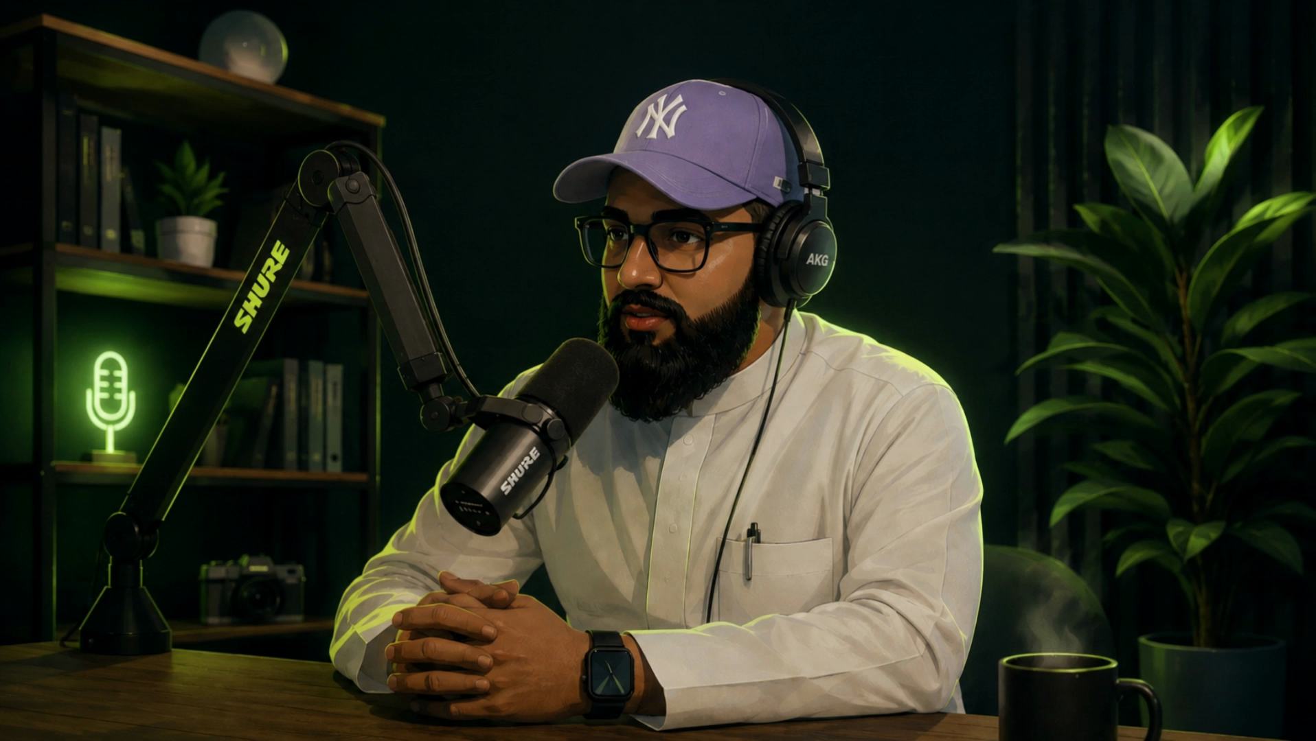
Barakah Blueprint is the product line within Shareefico: the podcast and everything built around it. It inherits the full system and leans hardest on lime-on-void, and it is the one surface where the faith framing leads instead of underpinning. Guests, show notes and clips all follow the same rules on this page.
Episode art stays in the green studio world. No stock, no white backgrounds.
Clips watermark with the faded mark, bottom right, never the wordmark.
Titles are claims a practitioner can defend, not curiosity bait.
Faith terms lead here. This surface is where barakah is said plainly.